Every part of this logo was chosen on purpose.
It's not just a coin with a tree on it. Here's what each element actually means, and why it fits a company doing diagnostics for circular electronics.
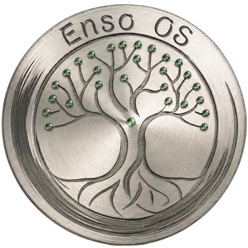
円 (ensō) is the Zen brushstroke circle, drawn in one breath. It stands for the universe, completeness, strength found in simplicity. Our mark is a brushed-steel disc with concentric ridges, similar to the growth rings you'd find inside a tree stump. Time and renewal, cast in metal.
The canopy splits into two mirrored halves, an implicit yin-yang. Economy and ecology, old hardware and renewed hardware, extraction and regeneration. That balance is a real part of how the business is meant to work, not just a nice picture.
The roots reach back into the same disc the branches grow out of. Value returns to where it started instead of getting thrown away after one use. That's basically what a circular economy means.
Each green gem sits at a branch tip like a leaf. It also happens to look like a diagnostic checkpoint, which wasn't an accident. Battery, storage, memory, display. Separate points of verified health that add up to one working device.
Brushed metal is the hardware layer, the actual material our diagnostics run against, fused with a living symbol. Tech and nature in one object. That's basically the company in a single image.
The short version: the ensō carries strength, the tree carries balance, and the steel carries the hardware part of the business.